We can’t all be interior decorators! But you don’t have to be the next Joanna Gaines to pull together a bathroom look all your own.
Use these 5 steps to help build (and pull off!) a cohesive color palette for your bathroom project:
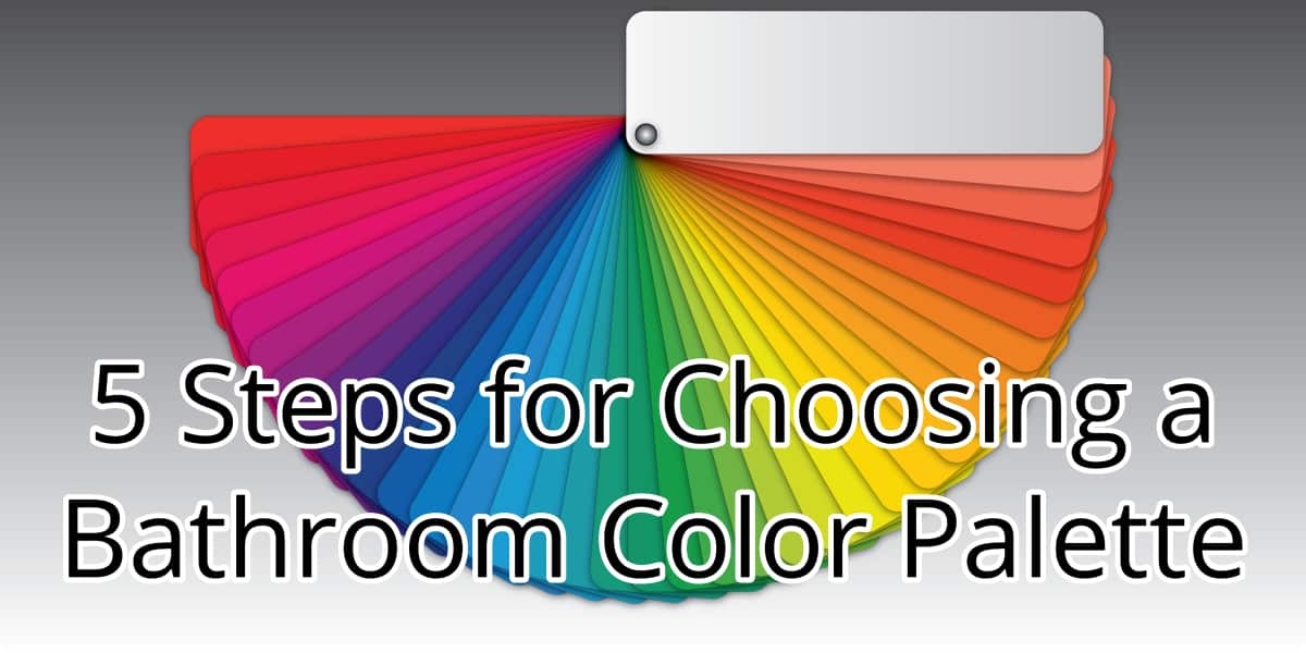
Look at the Color Wheel
Many of the most beautiful bathroom color schemes come directly from following the rules of the color wheel.
Blues and oranges go together because they are complementary, found on opposite sides of the color wheel. You can also use colors right next to your base color on the color wheel, such as yellow with green.
Don’t forget your neutrals! They can really anchor your color scheme.
Identify Fixed Colors
Do you have a colored tub, toilet, or tile and no plans to replace them? Don’t fight it!
Putting in random colors that do not coordinate will make your bathroom feel less put together.
A blue tub can be the base for a beach-themed bathroom. Bring in some sandy browns and seashell whites to create a beach house vibe.
If you have an older olive green toilet, use it as inspiration for a plant theme. Use colors and decor from nature!
Multi-colored tile halfway up the wall? You get the idea. Work with the colors, not against them.
Consider the Mood You Want to Create
Do you want your bathroom to be bright and cheery? Perhaps it can help you wake up and be ready to tackle the day.
Maybe you want your bathroom to be a zen place to wash away the stress of a long work day.
The colors you choose will have an effect on your mood, as well as your guests. Choose uplifting yellows, pinks, and brights for an invigorating feel. Blues, greens, and purples will make your bathroom feel calming.
Mix Neutrals
Neutrals are foolproof. Choose two, like gray and white, and use a 70:30 ratio. You can add interest using different textures and patterns in your flooring, shower curtain, or rugs.
Stripes are a classic choice, or use geometric shapes to express your creative side.
Neutrals are a great base, and allow you to add a pop of color as the seasons, or your tastes, change.
The Rule of Threes
There are actually two “rules” of three.
One is that you use no more than three colors. Second, you want at least three items per color so that none of them look haphazardly thrown in there.
For a three-color palette, use a similar ratio as with neutrals. Your lightest color should account for 70% of the space, the second lightest 20%, and your boldest color 10%.
As with any decorating rule, this is really more of a guideline to get you started. Once you have a better idea of what you want, and feel more confident in executing it, you can always use more or fewer colors. The only real rule here is that you need to love it!
Professional Interior Painters in Commerce Township, MI
Looking for a new color pallette to update your bathroom? Call Armor Tough Coatings!
From prep to finish, our attention to detail ensures that you end up with a finished project that you will love. Our 3- and 5-year warranties cover any damage chips, peeling, or cracks (not due to force) without any additional cost to you! Schedule a consultation today!


